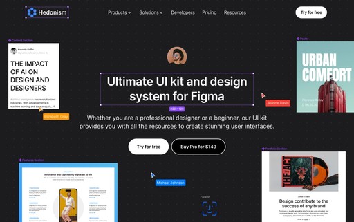
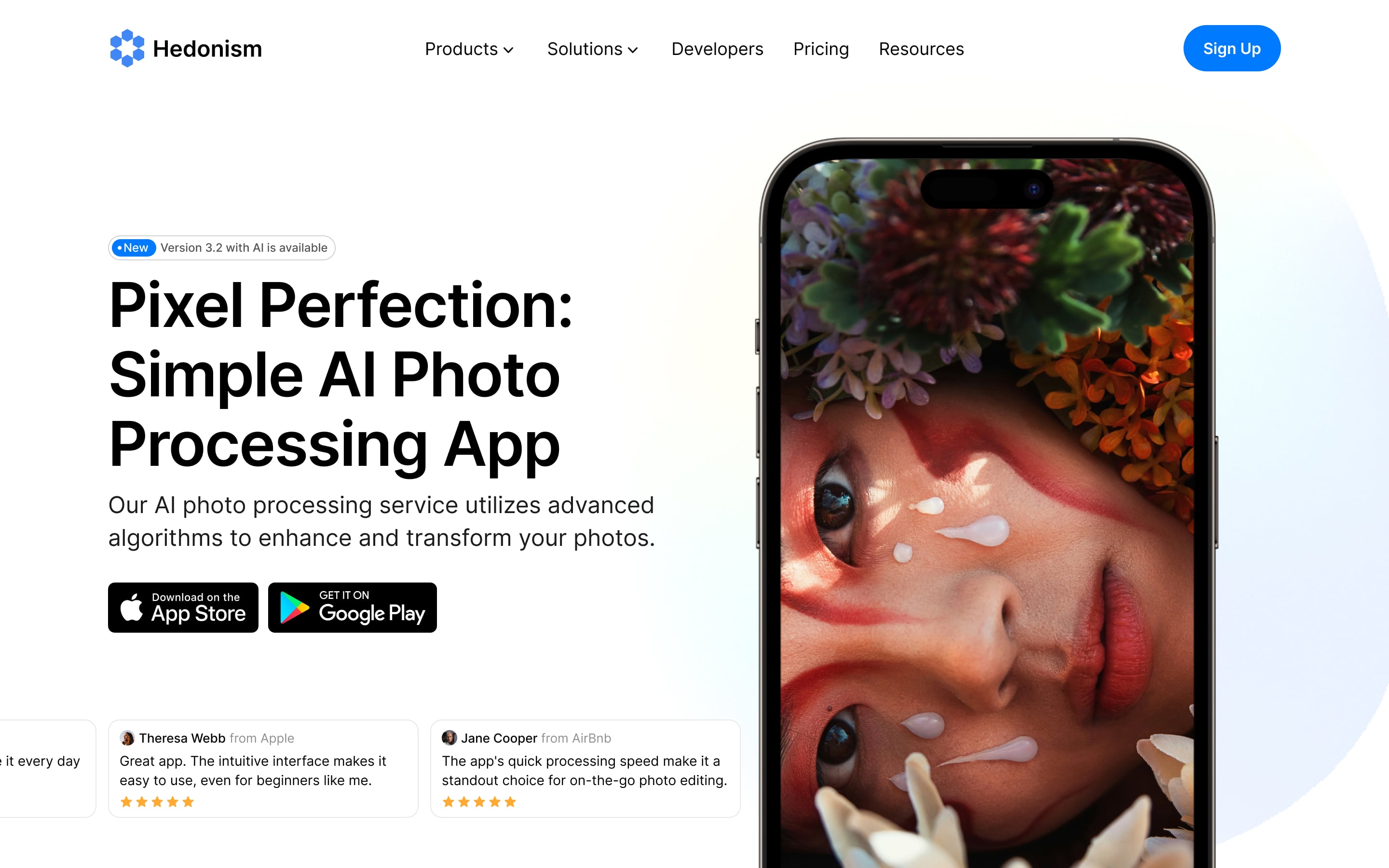
Hedonism UI offers a comprehensive design system that includes 3500+ sections, components, items, styles.


Join 300+ amazing designers... 🪂
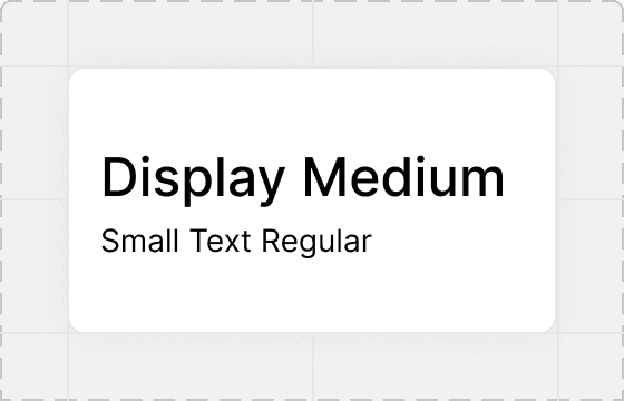
Auto, Smart and Easy
Design Quickly With Smart Components
A diverse set of design elements with smart variations, created using Auto Layout 5.0 and Figma's latest features. Easily customize colors, fonts, and layout to match your preferences with full control over designs.
Auto Layout 5.0
with latest variable capabilities
See components
Fast and Easy Customize
make any change in a second
See components
Comprehensive Library
to meet every design needs
See components
Clear and Smart Components
to save valuable design hours
See components


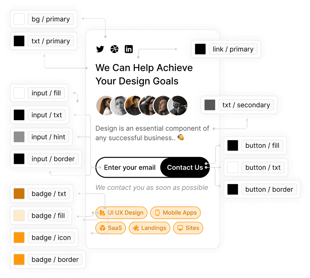
Styles With One-click-customize
Customize to Match Your Design Aesthetic
Achieve a distinctive and unified design by effortlessly customizing colors, typography, and effects with already setup 500+ styles. Enjoy full control to make changes across the entire library with just one click.
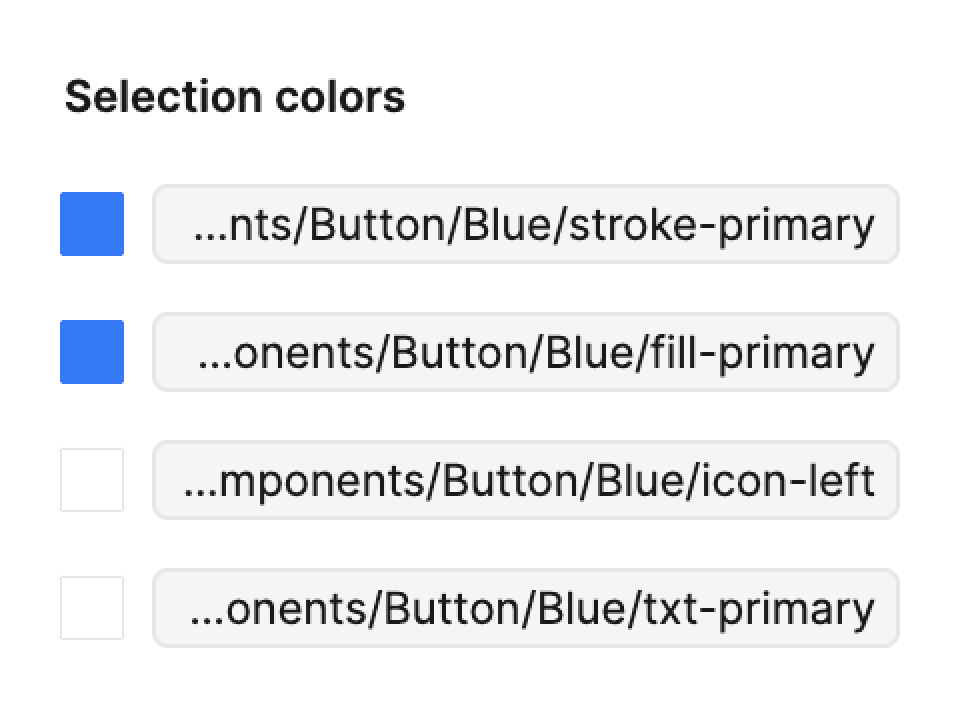
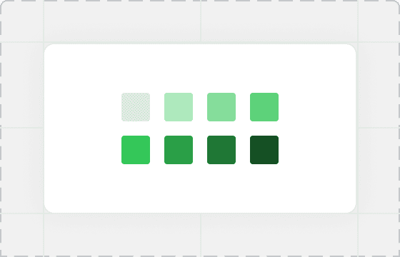
Vibrant Color Pallete
with 240+ colors and gradients
See components
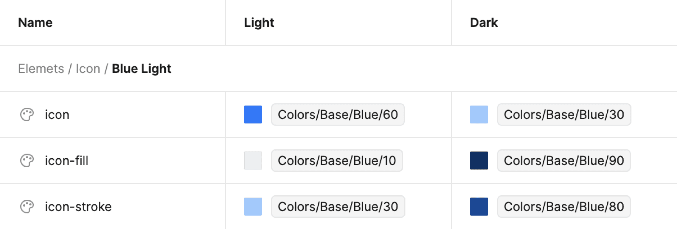
Ready-made Color Modes
with one-touch customization
See components
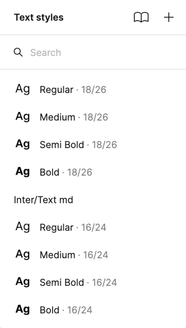
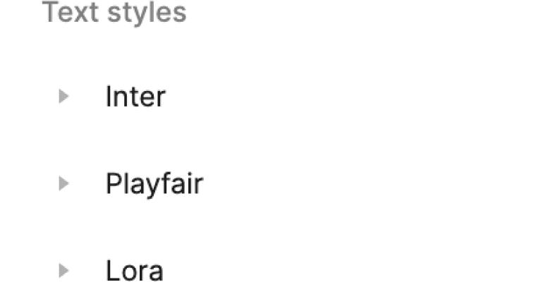
3 Fonts Typography System
with 13 essential text styles each
See components
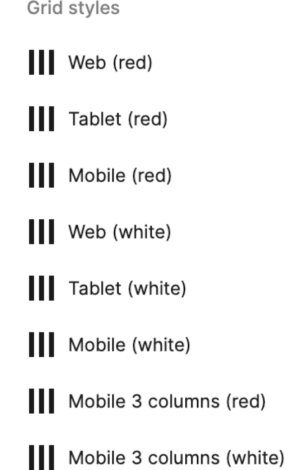
Usefull Effects & Grid System
5+ grid systems and 3+ effects
See components
2300+ Assets & Variants
Extended Library to Save Valuable Time
Streamline your design process with Hedonism UI, featuring an extensive library of icons, avatars, logos, brands, backgrounds, and device mockups. Save valuable time and bring your vision to life effortlessly.
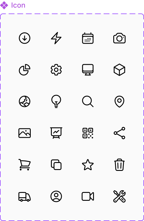
1,500+ Icons, Flags, Emoji
various and comprehensive set
See components
300+ Backgrounds & Mockups
useful desktop and mobile options
See components
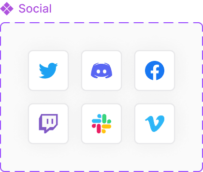
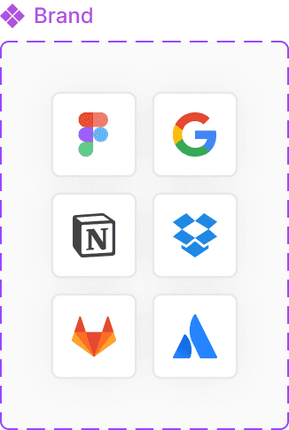
250+ Logos & Brands
popular brands and placeholders
See components
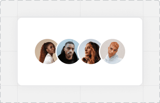
300+ Avatars & Memoji
vibrant, plain or black and white
See components


480+ Core Components
Core Design Items to Fulfill All Your Needs
Explore our vast collection of 480+ ready-to-use design core components, providing everything you need for contemporary design. Mix and match items and variants to saving you time compared to weeks of design work.
70+ Buttons
plent of sizes, shapes, content
See components
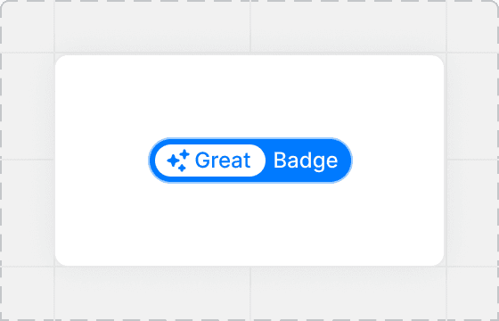
90+ Badges
to highlight the most important
See components
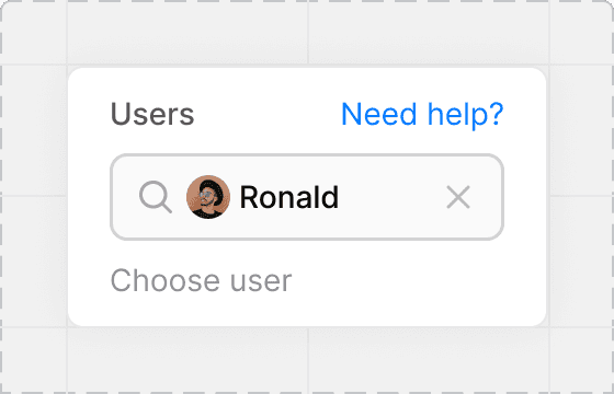
270+ Inputs
variety of shapes and filling
See components
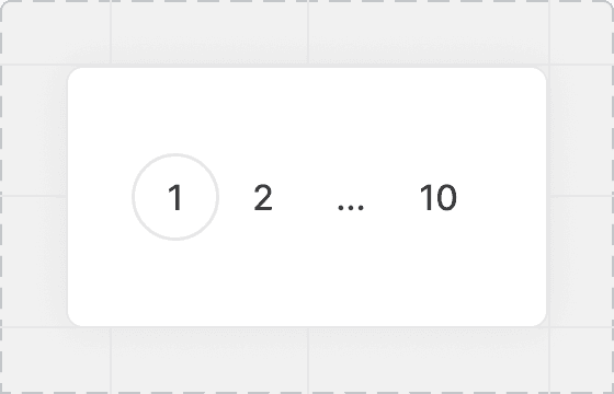
50+ Tabs & Paginations
convenient navigation forms
See components

Dark Mode
Say goodbye to color mode issues and focus on creating exceptional user experiences.
530+ sections ready to use, allowing you to jumpstart your design process and save valuable time
Students & Begginers
UI Kit provides you with all the resources you need to create stunning user interfaces.
Startups
Easy customize the UI elements to match your brand's identity and aesthetic preferences.
Design Teams
Integrated Figma's powerful collaboration features, enabling to seamlessly work with team.
Freelance Designers
Save time and jumpstart your design process with convenient pre-designed templates.


Over 3,500+ foundations, base components and more...
Take a look at Hedonism UI design elements in Figma


About the Hedonism UI Beta
We are always happy to receive feedback with your reviews and suggestions.